Apple's iOS 13 and iPadOS was released this fall, and among the many changes (and bugs) was one small one tweak to the Safari web browser that web developers will need to understand: Safari now requests the desktop version of website by default in iPadOS.
What does that mean, exactly? Let's talk about user agent strings.
User Agent Strings in iPadOS
Older versions of Safari include iPad in their user agent string. Safari in iPadOS now identifies itself to web servers as a desktop browser by default (users can turn this off, but most won't).
This is the user agent string from Safari on iPadOS (13.1.2):
Mozilla/5.0+(Macintosh;+Intel+Mac+OS+X+10_15)+AppleWebKit/605.1.15+(KHTML,+like+Gecko)+Version/13.0.1+Safari/605.1.15
Compare this to Safari on MacOS (Mojave, 10.14.6):
Mozilla/5.0+(Macintosh;+Intel+Mac+OS+X+10_14_6)+AppleWebKit/605.1.15+(KHTML,+like+Gecko)+Version/13.0.2+Safari/605.1.15
Notice how there is no mention of iPad or mobile or iPhone anywhere in the iPadOS Safari user agent - it reads almost identical to the desktop browser. User agent strings have never been a foolproof way to identify a user's device, and this really proves that point.
For comparison's sake, here's mobile Safari on an iPhone XR running iOS 13.1.2:
Mozilla/5.0+(iPhone;+CPU+iPhone+OS+13_1_2+like+Mac+OS+X)+AppleWebKit/605.1.15+(KHTML,+like+Gecko)+Version/13.0.1+Mobile/15E148+Safari/604.1
What iPadOS Means for Sitecore Developers
If you're using Sitecore's device detection features to readily distinguish between phone, tablet, and desktop devices, iPad devices will now load the desktop layouts of your sites.
From the standpoint of functionality, you should ensure that your website/webapp displays and behaves correctly across all devices, despite the user agent string. From a design perspective, you should (already) be using responsive design and fluid layouts (not discrete breakpoints!) to flow content intelligently across different viewport sizes.
There may be other ways to identify an iPad user, but those may end up being hacks in the long-run, so its best to design content for web standards, not specific devices.
When Device Detection Goes Bad
Multitasking in iPadOS presents a great example of the new desktop-first mentality that Safari is going for - and what it looks like when device detection goes wrong.
Here's an example of two websites in Safari side-by-side with a 50/50 split:
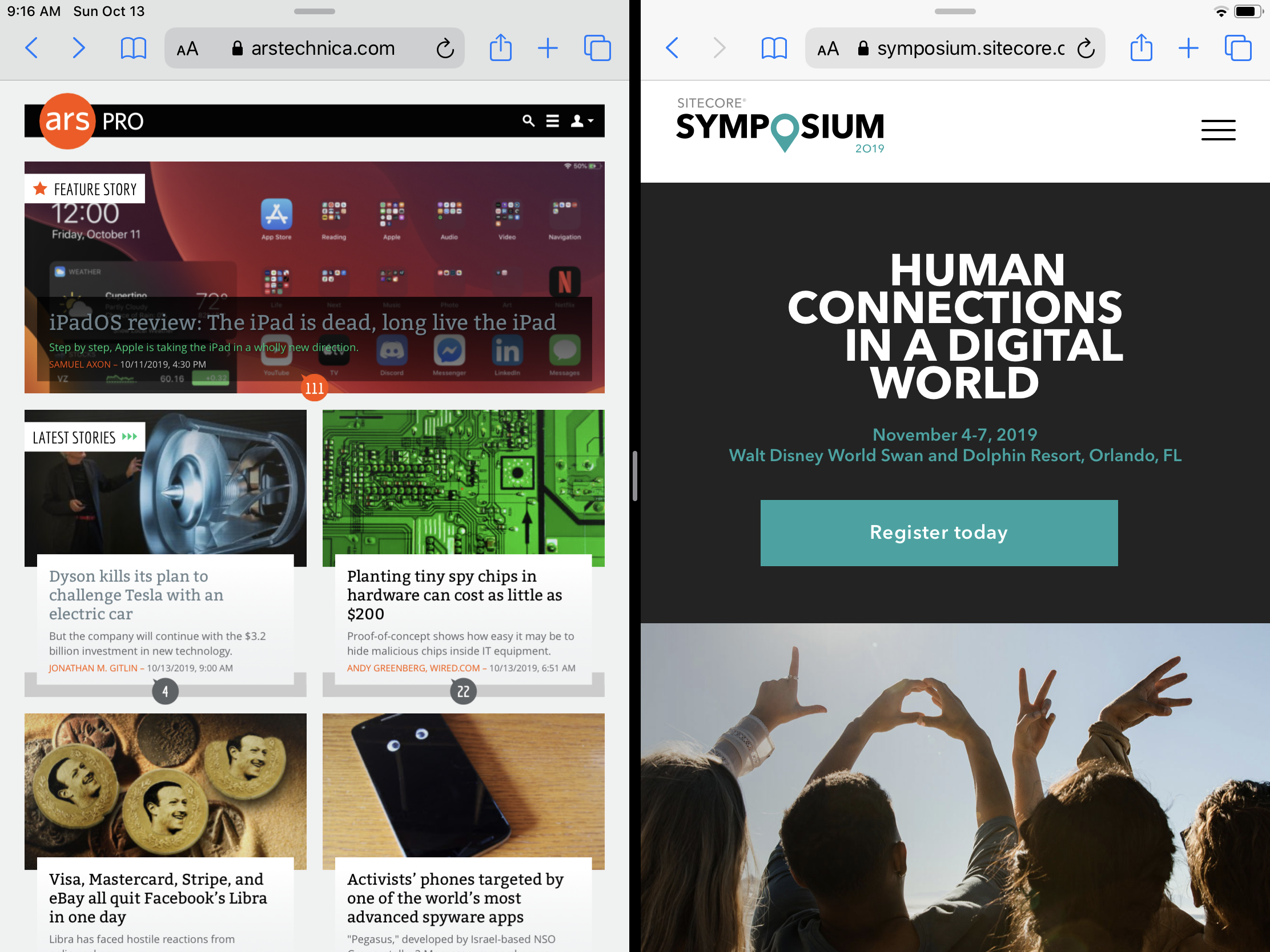
Ars Technica (left) uses device detection to serve mobile- and desktop-specific versions of their site. This looks okay in the iPad's split view. The Sitecore Symposium marketing site (right) uses a fluid design to fit any viewport and looks pretty good here (notice that it's using a mobile-friendly hamburger menu to keep navigation clean).
Here's the same two sites with a 30/70 split:

Ars Technica is still serving the desktop experience and completely failing to render in an acceptable way for its narrow viewport. The Sitecore Symposium site is still serving the same content, but it's breathing a little better (notice that the navigation is now expanded, making better use of the available space).